

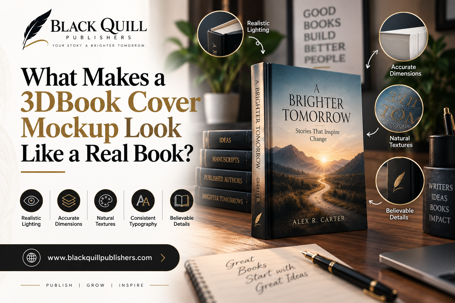
What Makes a 3D Book Cover Mockup Look Like a Real Book?

What Makes a 3D Book Cover Mockup Look Like a Real Book?
The artwork still has to look good, but that alone will not make the book believable. A book that is too thick, a spine that is the wrong size, or a shadow coming from the wrong direction can make the whole thing feel off. A convincing 3d book cover mockup design respects those rules.
The easiest test is whether the mockup could plausibly be the physical edition it represents. That affects the way the cover is placed, the camera angle, and how much detail belongs in the image.
The Cover Is Flat, the Book Is Not
A finished cover arrives as artwork. A physical book has several surfaces.
On a full wraparound cover, the front, spine, and back may appear next to one another in a single file. Once the cover is wrapped around a book, those panels face different directions. The spine sits between them, with the page block behind the cover giving the book much of its thickness.
That difference is easy to ignore in a straight-on presentation. It becomes obvious as soon as the book is turned.
Picture a paperback viewed from slightly above and to one side. As the front cover recedes toward the spine, the spine becomes a narrow strip, and the back cover follows the same perspective. Stretch the front artwork across a four-sided shape without accounting for those changes, and the separate parts can start to look as though they belong to different objects.
Binding changes the appearance again. A thin paperback has a relatively light edge and a flexible-looking cover. A substantial hardcover has more mass around its boards and spine. A dust jacket introduces another surface altogether. The mockup does not have to reproduce every manufacturing detail, but it should respect the broad physical characteristics of the edition.
That is why a good mockup begins with the book rather than with the template.
Start With the Actual Book, Not the Artwork
Before placing the cover, establish what is being represented.
Trim size gives the overall proportions. Page count gives an indication of thickness. Binding affects the shape of the spine and edges. The cover finish becomes important once lighting is introduced. The spine width determines how much space the spine text has and how much of it can be seen from an angle.
Spine width is particularly unforgiving on a thin book. A small increase can make the front cover appear to pull away from the page block. The same numerical error may be less noticeable on a thick novel, simply because the spine already occupies more of the object.
Page count should also be treated as a reality check rather than a decorative specification. A short poetry collection and a long novel may use the same trim size, but they should not produce identical book thickness. Paper choice and production details affect the final result, so a mockup does not need to pretend that page count gives an exact measurement. It does need to avoid proportions that contradict the edition.
The cover finish has a similar effect. Matte stock usually handles light softly. Gloss can produce a tighter reflection. A metallic title or foil detail may catch a highlight differently from the printed areas around it. If every surface receives the same treatment, the book can have the right dimensions and still look like a digital panel.
It is also worth deciding the intended viewing angle before doing detailed placement. If the spine carries the title and author name, the camera needs to leave enough of it visible. There is little point in creating an attractive angle that makes important information unreadable.
Where Does the Cover Go Wrong?
Some errors are obvious. Others are only a few pixels wide, yet they change the way the entire object reads.
A spine that is too wide can make a book appear heavier than the edition it represents. It also changes the balance of the composition. More spine means less visible front and back cover from the same camera position.
Typography is another useful warning sign. Letters on a curved or angled surface should follow the surface, but they should not appear distorted beyond what the physical shape would cause. A title that bends sharply while the spine itself barely turns gives the viewer two conflicting signals.
The page block can expose a problem that the cover hides. If the pages look paper-thin beneath a substantial cover, the book may appear hollow. If the page edges are too dark, they can look like another solid object rather than a stack of pages. Small inconsistencies around the cover edge can have the same effect.
Then there is the shadow. Imagine a book resting on a desk. The book faces slightly toward the light, but its shadow falls as if the light is coming from behind it. Nothing is technically wrong with the cover artwork. The object still feels impossible.
One useful test is to look at the mockup without paying attention to the cover design. Study the silhouette, page block, corners, and shadow. If the book looks wrong before the artwork is considered, no amount of cover polishing will solve the underlying problem.
Perspective Does More Work Than Most People Notice
Camera angle decides how much of the book is visible and how much room the cover occupies. It also changes the apparent thickness of the spine and page block.
A front-facing view gives the cover maximum space. The title remains large, the author name is easier to read, and the design itself does most of the work. This is often appropriate when the image will appear as a small product thumbnail.
A three-quarter view tells a different story. Now the viewer can see some of the spine and the edge of the pages. The book starts to feel like an object rather than a rectangle. That can be useful on an author website, especially where the image sits beside information about the book. The cost is reduced cover area. A title that was obvious from the front can become difficult to read after the cover recedes.
An angled or stacked arrangement introduces another decision. Showing several books can suggest a series or create a fuller presentation, but the books begin competing with one another. If the primary title is partly covered by another volume, the composition may look polished while doing a poor job of identifying the book.
The final display size matters here. A mockup should be checked after it has been reduced to the size readers will actually see. At full resolution, small spine text may appear perfectly clear. On a website card, it may disappear completely. The camera choice should be judged against that final use, not against the working file on a large monitor.
Lighting Can Make a Digital Cover Look Physical
Lighting is where many otherwise careful mockups lose their physical quality.
Start with the surfaces rather than the effects. If the front cover receives a bright highlight, look at what that light does to the spine and page edges. They do not need identical brightness, but their changes should belong to the same lighting setup. A bright front paired with a perfectly flat spine can make the cover look assembled from separate images.
Surface finish matters too. A matte cover should not throw back a sharp reflection like polished glass. A glossy cover can tolerate a tighter highlight. Foil or metallic elements can catch light more strongly than ordinary printed areas. These differences are small, but they help the viewer read the material.
Shadows have to establish contact as well as direction. A soft shadow directly beneath the book helps show where its weight meets the surface. A larger cast shadow can indicate the direction of the light. If the contact area is missing, the book may float. If the cast shadow is too dark, it can become a second visual object and distract from the cover.
The background completes the setup. A pale book against a pale background can lose its edges. A busy desk or heavily textured scene can create the opposite problem by pulling attention away from the cover. The background only needs enough information to support the book's shape and placement.
Good lighting is not necessarily dramatic lighting. In a product-style mockup, it often works better when the viewer notices the book first and the lighting second.
When Should a Mockup Show the Cover, and When Should It Show the Book?
The answer depends on what the image needs to communicate.
A bookstore listing has a difficult constraint. The image may be small, and it may sit beside many other covers. Recognition matters. A three-quarter angle that shows beautiful page edges can still be the wrong choice if it reduces the title to a few unreadable lines.
An author website has more flexibility. The physical form can support the surrounding page. Showing the spine, a little page thickness, or a gentle surface shadow can make the edition feel tangible without hiding the cover.
Social media introduces cropping. A composition that works in a wide announcement graphic may lose the title when it is cut into a smaller format. This is why the final crop should be tested before the mockup is approved.
A publisher or author presentation can justify showing more of the complete object. If the purpose is to discuss the finished edition, the spine and back cover may be useful information rather than decoration.
There is also a difference between representing a book and advertising it. A representation can spend more space showing the object. An advertisement often needs the title to win the first few seconds of attention. The same book can therefore need two different mockups without either one being inaccurate.
A Simple Workflow for Building the Mockup
Start with the edition details. Confirm the trim size, binding, page count, cover finish, and spine width. If the physical specifications are unknown, keep the mockup clearly conceptual rather than presenting guessed dimensions as though they were exact.
Next, inspect the artwork itself. Make sure the front, spine, and back are complete. Check names, titles, alignment, and any illustration that crosses from one panel to another. A mockup is a poor place to discover a cover file has an error.
Choose the camera before fine-tuning the artwork. Decide what needs to remain visible and give those elements enough space. If the spine matters, do not turn the book so far that the spine becomes a narrow dark line.
Then establish the physical form. Fit each panel to its correct surface and set the book's thickness. Check the relationship between the cover and page block before adding strong shadows or reflections. Geometry is easier to correct before effects have been layered over it.
Once the shape works, build the lighting. Match the highlights to the cover finish and keep the contact shadow believable. Then inspect the typography at the actual output size. This is a separate check from inspecting it at full resolution because small type behaves very differently after reduction.
Finally, look at the whole image without zooming in. Ask whether the book appears to have weight, whether the light agrees with the surfaces, and whether the cover still has enough room to communicate its message.
Only then should the image be exported for its intended destination.
When a Realistic Mockup Becomes Too Realistic
There is a point where realism starts taking attention away from the book.
A desk, coffee cup, reading glasses, strong reflections, deep shadows, and textured surfaces can create a convincing scene. They can also turn the cover into background information. This matters when the mockup is being used to sell or identify a specific title.
A cover-first image keeps the artwork dominant. An object-first image gives more attention to thickness, binding, edges, and material. A scene-first image treats the book as part of a wider setting.
None of these treatments is automatically better. The useful question is what the viewer has to understand from the image. If the cover needs to be recognized immediately, extra scenery has a cost. If the physical edition is being presented to a publisher or author, some of that detail may earn its place.
The strongest mockup can therefore be quite restrained. A believable book, a sensible camera angle, and controlled lighting may communicate more than an elaborate scene.
What Should Be Checked Before the Mockup Goes Public?
The final inspection should happen at the actual display size.
Read the title and author name. Check the spine width and the alignment between front, spine, and back. Look at the page thickness and corners. Make sure no artwork has been cropped by the perspective or frame. Then examine the shadows and the background contrast.
If the image represents a specific edition, compare it with the real specifications. A mockup can look excellent and still be misleading if the spine is substantially wider than the actual book.
For 3d book cover mockup design, the final quality comes from several parts agreeing with one another. The artwork has to fit the physical book. The physical book has to make sense from the chosen camera angle. The lighting has to behave as though those surfaces occupy the same space. When those conditions are met, the mockup stops looking like artwork placed on a template and starts looking like a photograph of an edition.The artwork still has to look good, but that alone will not make the book believable. A book that is too thick, a spine that is the wrong size, or a shadow coming from the wrong direction can make the whole thing feel off. A convincing 3d book cover mockup design respects those rules.
The easiest test is whether the mockup could plausibly be the physical edition it represents. That affects the way the cover is placed, the camera angle, and how much detail belongs in the image.
The Cover Is Flat, the Book Is Not
A finished cover arrives as artwork. A physical book has several surfaces.
On a full wraparound cover, the front, spine, and back may appear next to one another in a single file. Once the cover is wrapped around a book, those panels face different directions. The spine sits between them, with the page block behind the cover giving the book much of its thickness.
That difference is easy to ignore in a straight-on presentation. It becomes obvious as soon as the book is turned.
Picture a paperback viewed from slightly above and to one side. As the front cover recedes toward the spine, the spine becomes a narrow strip, and the back cover follows the same perspective. Stretch the front artwork across a four-sided shape without accounting for those changes, and the separate parts can start to look as though they belong to different objects.
Binding changes the appearance again. A thin paperback has a relatively light edge and a flexible-looking cover. A substantial hardcover has more mass around its boards and spine. A dust jacket introduces another surface altogether. The mockup does not have to reproduce every manufacturing detail, but it should respect the broad physical characteristics of the edition.
That is why a good mockup begins with the book rather than with the template.
Start With the Actual Book, Not the Artwork
Before placing the cover, establish what is being represented.
Trim size gives the overall proportions. Page count gives an indication of thickness. Binding affects the shape of the spine and edges. The cover finish becomes important once lighting is introduced. The spine width determines how much space the spine text has and how much of it can be seen from an angle.
Spine width is particularly unforgiving on a thin book. A small increase can make the front cover appear to pull away from the page block. The same numerical error may be less noticeable on a thick novel, simply because the spine already occupies more of the object.
Page count should also be treated as a reality check rather than a decorative specification. A short poetry collection and a long novel may use the same trim size, but they should not produce identical book thickness. Paper choice and production details affect the final result, so a mockup does not need to pretend that page count gives an exact measurement. It does need to avoid proportions that contradict the edition.
The cover finish has a similar effect. Matte stock usually handles light softly. Gloss can produce a tighter reflection. A metallic title or foil detail may catch a highlight differently from the printed areas around it. If every surface receives the same treatment, the book can have the right dimensions and still look like a digital panel.
It is also worth deciding the intended viewing angle before doing detailed placement. If the spine carries the title and author name, the camera needs to leave enough of it visible. There is little point in creating an attractive angle that makes important information unreadable.
Where Does the Cover Go Wrong?
Some errors are obvious. Others are only a few pixels wide, yet they change the way the entire object reads.
A spine that is too wide can make a book appear heavier than the edition it represents. It also changes the balance of the composition. More spine means less visible front and back cover from the same camera position.
Typography is another useful warning sign. Letters on a curved or angled surface should follow the surface, but they should not appear distorted beyond what the physical shape would cause. A title that bends sharply while the spine itself barely turns gives the viewer two conflicting signals.
The page block can expose a problem that the cover hides. If the pages look paper-thin beneath a substantial cover, the book may appear hollow. If the page edges are too dark, they can look like another solid object rather than a stack of pages. Small inconsistencies around the cover edge can have the same effect.
Then there is the shadow. Imagine a book resting on a desk. The book faces slightly toward the light, but its shadow falls as if the light is coming from behind it. Nothing is technically wrong with the cover artwork. The object still feels impossible.
One useful test is to look at the mockup without paying attention to the cover design. Study the silhouette, page block, corners, and shadow. If the book looks wrong before the artwork is considered, no amount of cover polishing will solve the underlying problem.
Perspective Does More Work Than Most People Notice
Camera angle decides how much of the book is visible and how much room the cover occupies. It also changes the apparent thickness of the spine and page block.
A front-facing view gives the cover maximum space. The title remains large, the author name is easier to read, and the design itself does most of the work. This is often appropriate when the image will appear as a small product thumbnail.
A three-quarter view tells a different story. Now the viewer can see some of the spine and the edge of the pages. The book starts to feel like an object rather than a rectangle. That can be useful on an author website, especially where the image sits beside information about the book. The cost is reduced cover area. A title that was obvious from the front can become difficult to read after the cover recedes.
An angled or stacked arrangement introduces another decision. Showing several books can suggest a series or create a fuller presentation, but the books begin competing with one another. If the primary title is partly covered by another volume, the composition may look polished while doing a poor job of identifying the book.
The final display size matters here. A mockup should be checked after it has been reduced to the size readers will actually see. At full resolution, small spine text may appear perfectly clear. On a website card, it may disappear completely. The camera choice should be judged against that final use, not against the working file on a large monitor.
Lighting Can Make a Digital Cover Look Physical
Lighting is where many otherwise careful mockups lose their physical quality.
Start with the surfaces rather than the effects. If the front cover receives a bright highlight, look at what that light does to the spine and page edges. They do not need identical brightness, but their changes should belong to the same lighting setup. A bright front paired with a perfectly flat spine can make the cover look assembled from separate images.
Surface finish matters too. A matte cover should not throw back a sharp reflection like polished glass. A glossy cover can tolerate a tighter highlight. Foil or metallic elements can catch light more strongly than ordinary printed areas. These differences are small, but they help the viewer read the material.
Shadows have to establish contact as well as direction. A soft shadow directly beneath the book helps show where its weight meets the surface. A larger cast shadow can indicate the direction of the light. If the contact area is missing, the book may float. If the cast shadow is too dark, it can become a second visual object and distract from the cover.
The background completes the setup. A pale book against a pale background can lose its edges. A busy desk or heavily textured scene can create the opposite problem by pulling attention away from the cover. The background only needs enough information to support the book's shape and placement.
Good lighting is not necessarily dramatic lighting. In a product-style mockup, it often works better when the viewer notices the book first and the lighting second.
When Should a Mockup Show the Cover, and When Should It Show the Book?
The answer depends on what the image needs to communicate.
A bookstore listing has a difficult constraint. The image may be small, and it may sit beside many other covers. Recognition matters. A three-quarter angle that shows beautiful page edges can still be the wrong choice if it reduces the title to a few unreadable lines.
An author website has more flexibility. The physical form can support the surrounding page. Showing the spine, a little page thickness, or a gentle surface shadow can make the edition feel tangible without hiding the cover.
Social media introduces cropping. A composition that works in a wide announcement graphic may lose the title when it is cut into a smaller format. This is why the final crop should be tested before the mockup is approved.
A publisher or author presentation can justify showing more of the complete object. If the purpose is to discuss the finished edition, the spine and back cover may be useful information rather than decoration.
There is also a difference between representing a book and advertising it. A representation can spend more space showing the object. An advertisement often needs the title to win the first few seconds of attention. The same book can therefore need two different mockups without either one being inaccurate.
A Simple Workflow for Building the Mockup
Start with the edition details. Confirm the trim size, binding, page count, cover finish, and spine width. If the physical specifications are unknown, keep the mockup clearly conceptual rather than presenting guessed dimensions as though they were exact.
Next, inspect the artwork itself. Make sure the front, spine, and back are complete. Check names, titles, alignment, and any illustration that crosses from one panel to another. A mockup is a poor place to discover a cover file has an error.
Choose the camera before fine-tuning the artwork. Decide what needs to remain visible and give those elements enough space. If the spine matters, do not turn the book so far that the spine becomes a narrow dark line.
Then establish the physical form. Fit each panel to its correct surface and set the book's thickness. Check the relationship between the cover and page block before adding strong shadows or reflections. Geometry is easier to correct before effects have been layered over it.
Once the shape works, build the lighting. Match the highlights to the cover finish and keep the contact shadow believable. Then inspect the typography at the actual output size. This is a separate check from inspecting it at full resolution because small type behaves very differently after reduction.
Finally, look at the whole image without zooming in. Ask whether the book appears to have weight, whether the light agrees with the surfaces, and whether the cover still has enough room to communicate its message.
Only then should the image be exported for its intended destination.
When a Realistic Mockup Becomes Too Realistic
There is a point where realism starts taking attention away from the book.
A desk, coffee cup, reading glasses, strong reflections, deep shadows, and textured surfaces can create a convincing scene. They can also turn the cover into background information. This matters when the mockup is being used to sell or identify a specific title.
A cover-first image keeps the artwork dominant. An object-first image gives more attention to thickness, binding, edges, and material. A scene-first image treats the book as part of a wider setting.
None of these treatments is automatically better. The useful question is what the viewer has to understand from the image. If the cover needs to be recognized immediately, extra scenery has a cost. If the physical edition is being presented to a publisher or author, some of that detail may earn its place.
The strongest mockup can therefore be quite restrained. A believable book, a sensible camera angle, and controlled lighting may communicate more than an elaborate scene.
What Should Be Checked Before the Mockup Goes Public?
The final inspection should happen at the actual display size.
Read the title and author name. Check the spine width and the alignment between front, spine, and back. Look at the page thickness and corners. Make sure no artwork has been cropped by the perspective or frame. Then examine the shadows and the background contrast.
If the image represents a specific edition, compare it with the real specifications. A mockup can look excellent and still be misleading if the spine is substantially wider than the actual book.
For 3d book cover mockup design, the final quality comes from several parts agreeing with one another. The artwork has to fit the physical book. The physical book has to make sense from the chosen camera angle. The lighting has to behave as though those surfaces occupy the same space. When those conditions are met, the mockup stops looking like artwork placed on a template and starts looking like a photograph of an edition.