

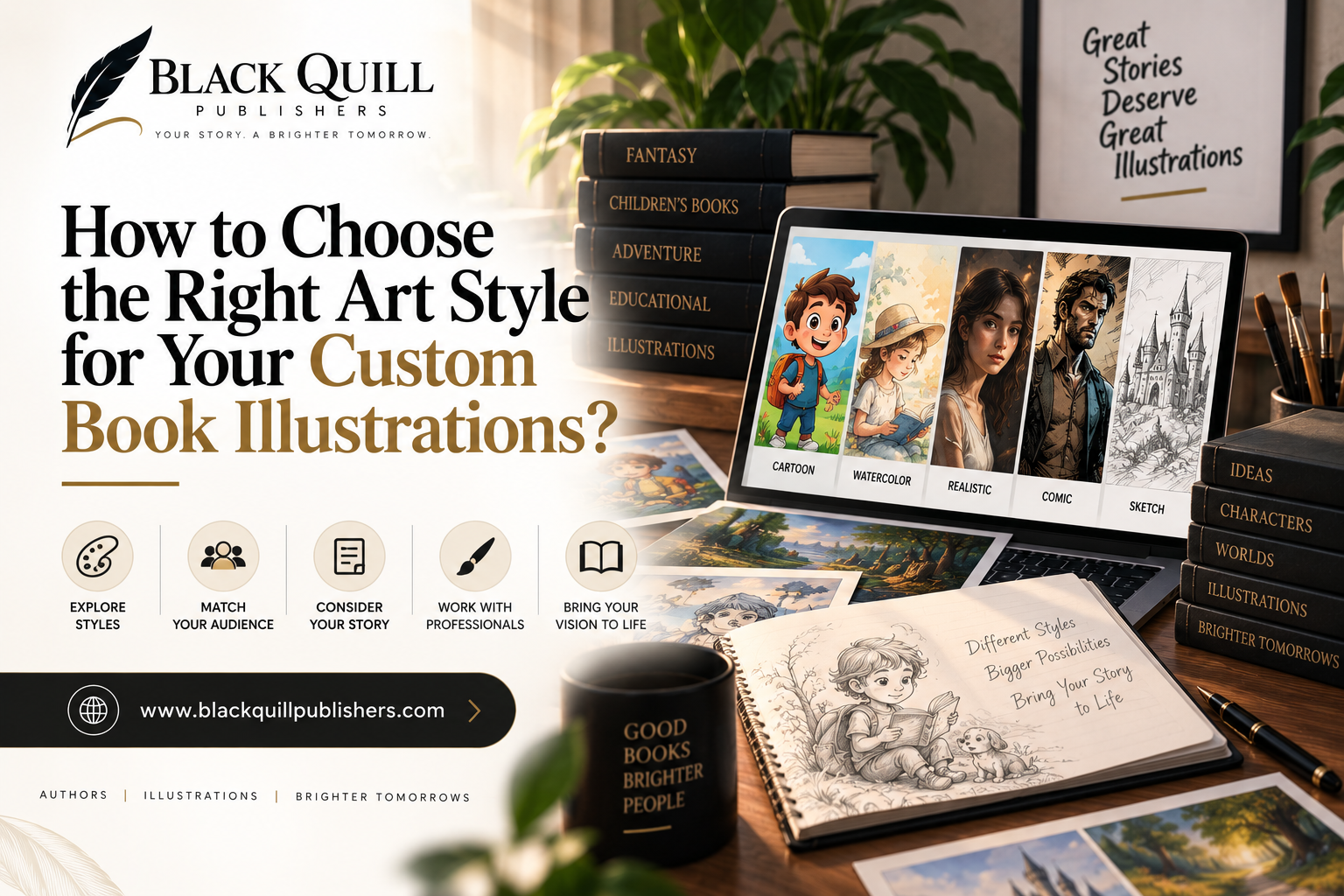
How to Choose the Right Art Style for Your Custom Book Illustrations?

How to Choose the Right Art Style for Your Custom Book Illustrations?
An author can spend an afternoon looking through illustration portfolios and come away with three or four book-art styles that all seem perfect. One may have the right colors. Another may handle faces beautifully. A third may have the kind of loose, expressive line work that seemed to fit the manuscript from the moment it was discovered.
Then the practical questions begin.
Can that style distinguish eight recurring characters?
Can it handle a scene in which those characters are standing together?
Will the details survive printing?
These questions often change the decision. Choosing an illustration style is partly an artistic judgment, but a book also puts demands on the artwork that a single portfolio image cannot reveal.
The manuscript, intended readers, page design, production schedule, and working method of the illustrator all have a bearing on the choice.
Start With the Manuscript, Not an Illustration Pinterest Board
The manuscript contains more information about the appropriate visual direction than a collection of favorite artwork ever will.
Before looking for references, pull out the things the illustrations will have to carry. List the principal characters and note anything about their appearance that the reader needs to recognize. Mark recurring locations.
Note the time period, important objects, major actions, changes in mood, and scenes where the image has to clarify something that would be difficult to clarify its context from the text alone; a children's mystery, for example, could keep returning to the same house, school corridor, garden and attic; the specificity of those places need enough visual identity that the reader can tell them apart.
If a particular key, photograph, or toy becomes important to the plot, its appearance cannot drift from one illustration to the next.
The manuscript can also expose problems before an art style is chosen. A story with two characters who spend most of their time in separate settings gives an illustrator considerable room. A story with twelve characters who regularly appear in groups is much less forgiving. Faces, silhouettes, clothing, scale, and body language all become part of the visual system.
That information should shape the search for references.
Build a Reference Board That Says Something
Reference images are most useful when each one has a job.
A board containing twenty attractive illustrations can create the illusion of direction while giving an illustrator very little to work with. One character may have realistic proportions, another may be highly stylized. The color palettes may range from muted earth tones to saturated primary colors. Some references may use delicate pencil lines while others depend on heavy digital rendering.
There is nothing wrong with liking all of them. They simply do not form a coherent brief.
A more useful board might have a few character references, several examples of environmental treatment, one or two color references, and separate examples for lighting, texture, line quality, and composition. The categories do not have to be formal, but the distinctions help.
The author should be able to explain what was borrowed from each reference. "I like the loose line work here, the limited palette in this one, and the way nighttime scenes are handled in this example" gives an illustrator useful information. It also leaves room for the illustrator to develop a style that belongs to the book rather than copying a collection of existing images.
Let the Story Decide How Much Detail It Can Carry
Detail has a cost beyond money.
Imagine a spread showing four children searching a cluttered workshop. There are tools on the walls, boxes on the floor, shelves behind the characters, handwritten notes on a workbench, and a paragraph of text beneath the image. A highly rendered style could make the workshop fascinating. It could also make the scene difficult to read.
The reader needs to notice the children, understand where they are looking, and find the object that matters to the plot. Every additional mark competes for attention.
Now compare that with a quiet full-page illustration of the same workshop after everyone has left. There is more room for texture, small objects, shadows, and atmospheric detail because the scene is asking the reader to look rather than quickly understand an action.
Illustration frequency changes the calculation too. A book with one large image every few chapters can support a more elaborate treatment than a picture book requiring illustrations throughout nearly every spread. Page dimensions matter. So does the amount of text surrounding the image.
Reader age enters the decision here as well. Young readers may need a scene to communicate its essential action almost immediately. Older readers can spend more time examining a complicated image because the prose provides additional context.
Custom Book Illustrations Need a Style That Survives the Whole Book
A portfolio sample is a finished destination. A book is a production process.
The same character may need to appear standing, sitting, running, sleeping, and shouting, looking away, and seen from the back. A setting may appear in sunlight on one page and during a storm twenty pages later. A new character may enter near the end of the manuscript. An object introduced casually in chapter two may become important in chapter nine.
A style that handles one of those situations beautifully may struggle with another.
Character construction is particularly revealing. If a character's identity depends on a very specific facial angle, what happens when the scene calls for a profile? If the likeness depends on tiny details around the eyes, can the character still be identified in a wide shot? If the clothing carries too much of the character's identity, will the reader recognize the person after a costume change?
Recurring environments have similar problems. An illustrator may create a wonderful bedroom in one image, then interpret the same room so differently under another lighting condition that it appears to be somewhere else. A strong visual style does not prevent variation. It gives the illustrator enough consistent rules to make variation feel intentional for custom book illustrations.
Test the Style on the Hardest Page
This is one of the most useful things an author can do before approving a direction.
Find the scene that will be difficult to illustrate. Perhaps six characters are arguing in a kitchen while one person is leaving through the back door. Perhaps a child is running through a crowded fairground looking for someone. Perhaps the scene takes place at night, and several objects need to remain visible.
Ask the illustrator to treat that scene as a genuine production sample.
A portrait will tell you whether the illustrator can draw an attractive face. A difficult scene tells you considerably more. You can see whether figures remain distinct when they overlap. You can see how the background is subordinated to the action. You can judge facial expressions, perspective, lighting, and the handling of small narrative details.
Print the sample at something close to its intended size. An image that looks wonderful at full screen resolution can lose fine facial features or delicate textures when reduced to a book page.
The test may reveal that the original style needs adjustment. That is useful information to have before twenty pages have been completed.
Match the Visual Language to the Reader
The intended reader changes the illustrator's job.
A picture book for very young children may need illustrations that communicate actions independently of the written sentence. A child should be able to look at a spread and understand who is present, what is happening, and where attention should go.
A middle-grade adventure can operate differently. The text may already establish the setting and action, allowing the artwork to concentrate on character, atmosphere, humor, or a particular visual detail.
A memoir or poetry collection presents another set of expectations. The images may be less concerned with explaining events and more concerned with creating associations or giving shape to an idea. An educational book may place a higher burden on diagrams, labels, sequence, and visual accuracy.
Genre matters, too, although it should not become a rigid rulebook. A fantasy novel does not have to look like every other fantasy novel. A departure can be effective when it suits the material. The important question is whether the visual choices help the intended reader enter the book rather than making the page harder to understand.
Beautiful, Appropriate, or Actually Useful?
Beauty has obvious value. An author has every reason to care about whether the finished pages are attractive.
It is worth separating that question from two others.
A style can be beautiful and still feel wrong for the story. It can be appropriate to the subject and audience yet provide very little help with the actual narrative. And it can be extremely useful while lacking the visual quality the author wants.
Consider a story involving a group of children who must identify one particular character in crowded scenes. A loose, atmospheric style may produce lovely spreads, but if the faces become difficult to distinguish whenever several figures appear together, it creates a practical problem.
The three questions are simple:
Does it look good?
Does it belong with this book?
Does it help the reader?
The strongest direction usually has a credible answer to all three.
Do Not Pick a Style Without Considering Production
The art direction eventually meets a schedule and an invoice.
A detailed watercolor treatment may require considerably more labor than a simpler graphic approach. That difference becomes significant when the manuscript calls for forty, sixty, or one hundred illustrations.
Revision is another factor. Suppose an author decides that a recurring character's jacket should be a different color after fifteen illustrations have already been completed. In a layered digital workflow, that change might be manageable. In artwork where color, texture, lighting, and surrounding elements have been painted together, the same request could involve substantial reworking.
The illustrator's process matters here. Ask how long a typical finished illustration takes. Ask how character references are maintained. Ask how revisions affect completed artwork. Ask what happens when a scene changes after the illustration has been started.
The cheapest style is not automatically the wisest choice. A more important question is whether the selected approach can be maintained at the required quality for the entire project.
Give the Illustrator Direction Without Micromanaging
Authors generally know their stories better than anyone else involved in the project. Illustrators know how to turn narrative information into images. A good working relationship makes use of both forms of knowledge.
Give the illustrator the facts that cannot be lost. A character's age, physical traits, clothing details, setting, period, important props, scene context, and emotional purpose may all matter. Explain what has to remain consistent across the book.
Then leave some decisions open.
An author may know that a character should look frightened while standing outside an abandoned house. That does not mean the author needs to specify the character's exact pose, camera angle, hand position, light source, line weight, and placement of every background object.
The illustrator has to solve the visual problem. Over-directing that process can remove the very expertise the author hired.
Test the Style as a Set of Pages
Once a promising direction has emerged, test several different scenes before moving into full production.
Choose a representative character scene. Add an environment that requires some detail. Test a quiet moment and a scene with more movement. If the manuscript contains nighttime scenes, include one. If group scenes are important, include one of those too.
Review the samples side by side.
Look for the things that are difficult to spot when each image is viewed alone. Does the same character still feel like the same person? Do locations have a shared visual identity? Does the color treatment hold together when the mood changes? Does one illustration look as though it came from another project?
The purpose is not to make every page uniform. A book needs rhythm and visual variety. The samples should feel related even when the scenes themselves are quite different.
Five Questions to Ask Before Approving the Art Direction
Before signing off on the full direction, ask:
- Does this style belong to this particular story?
- Can it handle the manuscript's most difficult scenes?
- Will recurring characters, locations, and objects remain recognizable?
- Does it suit the intended reader without making the artwork predictable?
- Can the illustrator maintain this approach across the full schedule and budget?
A style can be striking in isolation and still prove awkward once the book starts taking shape. The first sample is only the beginning. The more revealing evidence appears when the same visual language has to carry different scenes, different moods, and many pages.An author can spend an afternoon looking through illustration portfolios and come away with three or four book-art styles that all seem perfect. One may have the right colors. Another may handle faces beautifully. A third may have the kind of loose, expressive line work that seemed to fit the manuscript from the moment it was discovered.
Then the practical questions begin.
Can that style distinguish eight recurring characters?
Can it handle a scene in which those characters are standing together?
Will the details survive printing?
These questions often change the decision. Choosing an illustration style is partly an artistic judgment, but a book also puts demands on the artwork that a single portfolio image cannot reveal.
The manuscript, intended readers, page design, production schedule, and working method of the illustrator all have a bearing on the choice.
Start With the Manuscript, Not an Illustration Pinterest Board
The manuscript contains more information about the appropriate visual direction than a collection of favorite artwork ever will.
Before looking for references, pull out the things the illustrations will have to carry. List the principal characters and note anything about their appearance that the reader needs to recognize. Mark recurring locations.
Note the time period, important objects, major actions, changes in mood, and scenes where the image has to clarify something that would be difficult to clarify its context from the text alone; a children's mystery, for example, could keep returning to the same house, school corridor, garden and attic; the specificity of those places need enough visual identity that the reader can tell them apart.
If a particular key, photograph, or toy becomes important to the plot, its appearance cannot drift from one illustration to the next.
The manuscript can also expose problems before an art style is chosen. A story with two characters who spend most of their time in separate settings gives an illustrator considerable room. A story with twelve characters who regularly appear in groups is much less forgiving. Faces, silhouettes, clothing, scale, and body language all become part of the visual system.
That information should shape the search for references.
Build a Reference Board That Says Something
Reference images are most useful when each one has a job.
A board containing twenty attractive illustrations can create the illusion of direction while giving an illustrator very little to work with. One character may have realistic proportions, another may be highly stylized. The color palettes may range from muted earth tones to saturated primary colors. Some references may use delicate pencil lines while others depend on heavy digital rendering.
There is nothing wrong with liking all of them. They simply do not form a coherent brief.
A more useful board might have a few character references, several examples of environmental treatment, one or two color references, and separate examples for lighting, texture, line quality, and composition. The categories do not have to be formal, but the distinctions help.
The author should be able to explain what was borrowed from each reference. "I like the loose line work here, the limited palette in this one, and the way nighttime scenes are handled in this example" gives an illustrator useful information. It also leaves room for the illustrator to develop a style that belongs to the book rather than copying a collection of existing images.
Let the Story Decide How Much Detail It Can Carry
Detail has a cost beyond money.
Imagine a spread showing four children searching a cluttered workshop. There are tools on the walls, boxes on the floor, shelves behind the characters, handwritten notes on a workbench, and a paragraph of text beneath the image. A highly rendered style could make the workshop fascinating. It could also make the scene difficult to read.
The reader needs to notice the children, understand where they are looking, and find the object that matters to the plot. Every additional mark competes for attention.
Now compare that with a quiet full-page illustration of the same workshop after everyone has left. There is more room for texture, small objects, shadows, and atmospheric detail because the scene is asking the reader to look rather than quickly understand an action.
Illustration frequency changes the calculation too. A book with one large image every few chapters can support a more elaborate treatment than a picture book requiring illustrations throughout nearly every spread. Page dimensions matter. So does the amount of text surrounding the image.
Reader age enters the decision here as well. Young readers may need a scene to communicate its essential action almost immediately. Older readers can spend more time examining a complicated image because the prose provides additional context.
Custom Book Illustrations Need a Style That Survives the Whole Book
A portfolio sample is a finished destination. A book is a production process.
The same character may need to appear standing, sitting, running, sleeping, and shouting, looking away, and seen from the back. A setting may appear in sunlight on one page and during a storm twenty pages later. A new character may enter near the end of the manuscript. An object introduced casually in chapter two may become important in chapter nine.
A style that handles one of those situations beautifully may struggle with another.
Character construction is particularly revealing. If a character's identity depends on a very specific facial angle, what happens when the scene calls for a profile? If the likeness depends on tiny details around the eyes, can the character still be identified in a wide shot? If the clothing carries too much of the character's identity, will the reader recognize the person after a costume change?
Recurring environments have similar problems. An illustrator may create a wonderful bedroom in one image, then interpret the same room so differently under another lighting condition that it appears to be somewhere else. A strong visual style does not prevent variation. It gives the illustrator enough consistent rules to make variation feel intentional for custom book illustrations.
Test the Style on the Hardest Page
This is one of the most useful things an author can do before approving a direction.
Find the scene that will be difficult to illustrate. Perhaps six characters are arguing in a kitchen while one person is leaving through the back door. Perhaps a child is running through a crowded fairground looking for someone. Perhaps the scene takes place at night, and several objects need to remain visible.
Ask the illustrator to treat that scene as a genuine production sample.
A portrait will tell you whether the illustrator can draw an attractive face. A difficult scene tells you considerably more. You can see whether figures remain distinct when they overlap. You can see how the background is subordinated to the action. You can judge facial expressions, perspective, lighting, and the handling of small narrative details.
Print the sample at something close to its intended size. An image that looks wonderful at full screen resolution can lose fine facial features or delicate textures when reduced to a book page.
The test may reveal that the original style needs adjustment. That is useful information to have before twenty pages have been completed.
Match the Visual Language to the Reader
The intended reader changes the illustrator's job.
A picture book for very young children may need illustrations that communicate actions independently of the written sentence. A child should be able to look at a spread and understand who is present, what is happening, and where attention should go.
A middle-grade adventure can operate differently. The text may already establish the setting and action, allowing the artwork to concentrate on character, atmosphere, humor, or a particular visual detail.
A memoir or poetry collection presents another set of expectations. The images may be less concerned with explaining events and more concerned with creating associations or giving shape to an idea. An educational book may place a higher burden on diagrams, labels, sequence, and visual accuracy.
Genre matters, too, although it should not become a rigid rulebook. A fantasy novel does not have to look like every other fantasy novel. A departure can be effective when it suits the material. The important question is whether the visual choices help the intended reader enter the book rather than making the page harder to understand.
Beautiful, Appropriate, or Actually Useful?
Beauty has obvious value. An author has every reason to care about whether the finished pages are attractive.
It is worth separating that question from two others.
A style can be beautiful and still feel wrong for the story. It can be appropriate to the subject and audience yet provide very little help with the actual narrative. And it can be extremely useful while lacking the visual quality the author wants.
Consider a story involving a group of children who must identify one particular character in crowded scenes. A loose, atmospheric style may produce lovely spreads, but if the faces become difficult to distinguish whenever several figures appear together, it creates a practical problem.
The three questions are simple:
Does it look good?
Does it belong with this book?
Does it help the reader?
The strongest direction usually has a credible answer to all three.
Do Not Pick a Style Without Considering Production
The art direction eventually meets a schedule and an invoice.
A detailed watercolor treatment may require considerably more labor than a simpler graphic approach. That difference becomes significant when the manuscript calls for forty, sixty, or one hundred illustrations.
Revision is another factor. Suppose an author decides that a recurring character's jacket should be a different color after fifteen illustrations have already been completed. In a layered digital workflow, that change might be manageable. In artwork where color, texture, lighting, and surrounding elements have been painted together, the same request could involve substantial reworking.
The illustrator's process matters here. Ask how long a typical finished illustration takes. Ask how character references are maintained. Ask how revisions affect completed artwork. Ask what happens when a scene changes after the illustration has been started.
The cheapest style is not automatically the wisest choice. A more important question is whether the selected approach can be maintained at the required quality for the entire project.
Give the Illustrator Direction Without Micromanaging
Authors generally know their stories better than anyone else involved in the project. Illustrators know how to turn narrative information into images. A good working relationship makes use of both forms of knowledge.
Give the illustrator the facts that cannot be lost. A character's age, physical traits, clothing details, setting, period, important props, scene context, and emotional purpose may all matter. Explain what has to remain consistent across the book.
Then leave some decisions open.
An author may know that a character should look frightened while standing outside an abandoned house. That does not mean the author needs to specify the character's exact pose, camera angle, hand position, light source, line weight, and placement of every background object.
The illustrator has to solve the visual problem. Over-directing that process can remove the very expertise the author hired.
Test the Style as a Set of Pages
Once a promising direction has emerged, test several different scenes before moving into full production.
Choose a representative character scene. Add an environment that requires some detail. Test a quiet moment and a scene with more movement. If the manuscript contains nighttime scenes, include one. If group scenes are important, include one of those too.
Review the samples side by side.
Look for the things that are difficult to spot when each image is viewed alone. Does the same character still feel like the same person? Do locations have a shared visual identity? Does the color treatment hold together when the mood changes? Does one illustration look as though it came from another project?
The purpose is not to make every page uniform. A book needs rhythm and visual variety. The samples should feel related even when the scenes themselves are quite different.
Five Questions to Ask Before Approving the Art Direction
Before signing off on the full direction, ask:
1. Does this style belong to this particular story?
2. Can it handle the manuscript's most difficult scenes?
3. Will recurring characters, locations, and objects remain recognizable?
4. Does it suit the intended reader without making the artwork predictable?
5. Can the illustrator maintain this approach across the full schedule and budget?
A style can be striking in isolation and still prove awkward once the book starts taking shape. The first sample is only the beginning. The more revealing evidence appears when the same visual language has to carry different scenes, different moods, and many pages.